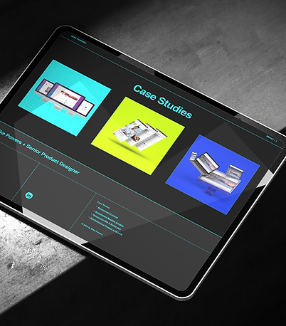
A showcase of innovative product design.
Design Systems from Scratch
Design System Strategy at Two Very Different Scales
Overview
In two very different environments—a fast-paced wellness startup and a large enterprise with multiple internal pods—I led the creation of separate, scalable, token-based design systems from the ground up. Both systems addressed inconsistent UI patterns, accessibility issues, and bottlenecks in team workflows.
At the startup, the system supported every RoundGlass product—internal tools, consumer-facing apps, and provider experiences.
At the enterprise org, it served eight pod teams building internal tools.
In both cases, the system became a reliable part of how teams worked, improving speed, design quality, and implementation consistency across the board.
Problem Statement
At the startup, disconnected teams had created overlapping and mismatched products. UI patterns varied, interaction models clashed, and users reported difficulty moving between apps. A redesign of the management console prompted leadership to support a more unified system that could be shared across products and teams.
At the enterprise org, internal tools lacked design oversight. Visual inconsistency and fragmented workflows made the tools harder to use and harder to maintain. My role was to introduce a scalable design system that would support more cohesive tooling while giving individual pods the flexibility to meet their specific needs.
Users & Audience
-
Designers
Used the system daily to build consistent and reusable interfaces
-
Engineers
Integrated tokens and components, and relied on shared logic and documentation
-
Product Managers
Reviewed and prioritized system work, and used it to help drive efficiency
-
Secondary collaborators
QA, content, accessibility reviewers, and support teams who relied on predictable UI behaviors
-
End users
Internal staff and customers who benefited from improved usability and accessibility
Role & Responsibilities
Senior Product and UX Designer
I was responsible for every layer of each system, including token architecture, component design, documentation, and developer coordination.
-
Startup
Owned the system end-to-end early on, later worked with three contributing designers and a Senior UI Engineer. I also partnered with an external brand manager to improve accessibility.
-
Enterprise
Built the original framework solo, then collaborated with a new Director of Product Design. We explored parallel directions before aligning on a unified approach. I remained the primary owner. All work was done internally, with no outside vendors.
Both roles were fully remote.

Scope & Constraints
Startup:
-
System was initially scoped for a 2-month build
-
Timeline extended to 6 months after discovery and planning
-
Built in parallel with large redesigns of web and mobile products
Enterprise:
-
No design system or brand standard existed
-
Needed to function across eight pods with varied processes
-
System matured during a leadership transition, which expanded support and adoption
Ground Truth: Auditing the Landscape
Revealing inconsistency through focused discovery
Assessing Fragmentation Across Teams
My first step was to audit live products, design files, and documentation across platforms.
At the startup, teams had developed multiple apps independently. I found visual inconsistencies, duplicated components, and accessibility issues across the board regarding typography, button styles, spacing, and more.
At the enterprise org, I focused on tools created by eight pods, each using its own patterns and logic with no connection between them.
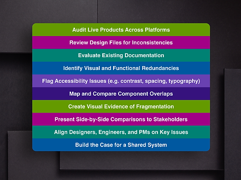
Mapping Redundancies and Building the Case
The audit helped surface overlapping solutions and design inconsistencies. I created visuals to show how these issues played out across products and teams, then used that to validate the case for a shared system.
These side-by-side comparisons made it easier to bring stakeholders into the conversation. By showing real examples, I was able to get designers, engineers, and PMs aligned early and move forward with a shared understanding of the challenges.
Early Alignment: Getting Teams on the Same Page
Surfacing Needs Through Cross-Team Conversations
Before any tokens or components were created, I spent time gathering input and perspective.
At the startup, I co-led working sessions with a PM to gather feedback from product teams. Teams used different naming systems, tools, and processes. These sessions revealed points of overlap and identified opportunities to simplify. While the format was informal, the outcome gave us enough alignment to move forward together.
At the enterprise org, conversations were more focused. I worked with our PM, a Technical Director from another pod, and two engineers to identify the most immediate needs and constraints. This gave us a clear path to begin with the pods that would benefit most from early adoption.

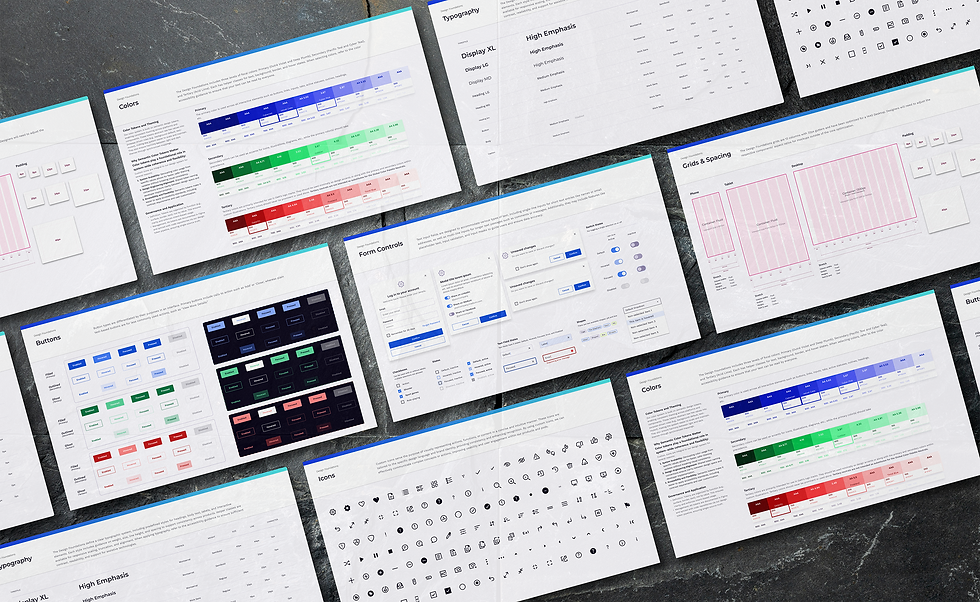
Foundations First: Token Logic and Visual Language
Building accessible, scalable design from the ground up
Reworking the Brand to Meet Real-World Needs
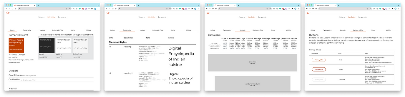
The startup’s brand didn’t translate well to digital products. Color palettes failed contrast checks. Typography didn’t scale well. Spacing and rhythm were inconsistent. I worked with our brand partner to adjust the palette and refine the type system, then created foundational tokens for spacing, elevation, and color that could scale across platforms.


Creating from Scratch at Scale
At the enterprise org, no design language existed. I built the foundation from zero—defining color, typography, spacing, elevation, and grid systems with accessibility at the core of each decision.
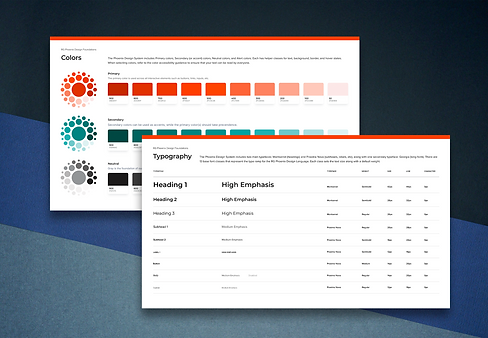
Establishing Tokens as the System Backbone
In both systems, I built a strong base token layer that informed every component. I defined tokens for typography, color, spacing, radius, and elevation, then created component-level variables on top. This allowed each system to scale without requiring constant reinvention.
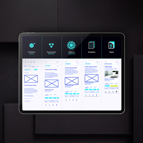
The Building Blocks: Components and Contribution
Designing reusable patterns and creating space for team input
Laying the Foundation in Figma
Once the token layer was in place, I began designing reusable components. Some were built from scratch, like buttons and inputs, while others were adapted from products I had already been working on in parallel. As the library grew to include more complex structures like nav bars and data tables, I established naming conventions, documented states, and organized everything to reduce ambiguity.
Opening Up the Contribution Model
At the startup, designers across the company were already reusing patterns, so I set clear guidelines for sharing ownership of the system. It gave teams enough direction to work efficiently without hindering each other's workflow.
At the enterprise org, I remained the primary owner even after our Director of Product Design joined the team. Her contributions helped us explore alternative layouts and naming logic, and we worked closely to refine and improve the structure.

Solving for Taxonomy Without Friction
At both companies, naming conventions varied widely. At the startup, most design teams followed atomic principles, but used inconsistent labels, such as "atoms," "primitives," or "base elements." I built a shared naming model that accounted for legacy terms while introducing structure.
At the enterprise org, engineering shorthand didn’t always match what design teams used. I added cross-references in Figma and recommended the same for Storybook to bridge the gap. That reduced confusion without forcing teams to adopt unfamiliar terms.
Bridging the Gap: Partnering with Engineering
Turning design systems into development-ready tools
Collaborating from Day One
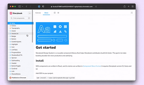
At the startup, I worked closely with a Senior UI Engineer to bring tokens and components into the codebase. We handled spacing logic, responsive behavior, and naming alignment as a team. Components were surfaced in Storybook, which gave us a shared space to review states, identify gaps, and document behavior as we went. This collaboration helped us spot missing states early and improve both the system and its documentation in real time.

Translating Design to Code
At the enterprise org, I worked with a group of engineers to build a shared Storybook instance that mirrored our Figma library. Having already used Storybook at the startup, I was able to assist with structuring the documentation and improving naming consistency between design and dev.
Closing the Loop Across Teams
Engineers played an active role throughout. Our feedback cycles included design and dev perspectives, which made the system more resilient and easier to maintain.
A design system isn’t just clean files or consistent tokens. It lives or dies in engineering. Developers have to trust the design enough to implement it faithfully, because they’re the ones who ultimately deliver the experience to the end user.
Keeping It Usable: Documentation and Governance
Making the system sustainable for new and veteran contributors alike
Creating a Single Source of Truth
At the startup, I created a centralized guide that covered system tokens, components, accessibility rules, and contribution steps. This guide helped onboard new designers and gave existing teams a place to double-check decisions.

Scaling Documentation Across Teams
At the enterprise level, I documented for a broader audience—some teams were new to the system, while others had more complex, team-specific use cases. To support both, I added inline notes and usage pointers directly in Figma, clarified edge cases with engineers, and made sure Storybook matched the structure and naming used in design. Eventually we were able to reduce back-and-forth questions during implementation and help teams use the system with less guesswork.
Maintaining Flexibility Without Losing Control
I kept governance as lightweight as possible. Contribution was open, but structured. The guidelines helped teams make confident changes without introducing drift.
Never Finished: Iteration and Leadership Alignment
Keeping the system alive through listening and evolution
Design Systems as Living Products
Both systems were treated as living products. I met regularly with teams to collect feedback, track pain points, and adjust documentation and structure based on how components were being implemented, where confusion came up, and what slowed teams down.
At the startup, I regularly connected with designers, engineers, and PMs to understand what was missing or confusing. These reviews helped us prioritize fixes and track usage over time.
Collaborating Across Leadership Shifts
At the enterprise org, system direction shifted after a new Director of Product Design joined. We explored changes in parallel and merged the strongest elements from both directions. The result was a more robust system that better reflected the needs of the organization.


Outcomes & Impact
How shared systems improved speed, quality, and consistency across teams

Key Results
Startup
-
90% adoption of new design system components within three months
-
30–40% reduction in design-to-dev implementation time, based on team estimates
-
Fewer QA flags tied to interaction and visual inconsistencies, noted during sprint reviews
Enterprise
-
60% increase in developer usage following Storybook integration
-
45% drop in UI-related support tickets within the first two months
-
Fewer internal escalations tied to tool confusion or inconsistency, improving team productivity
“This system was built with engineering in mind. The reference files, the logic, the structure… it’s all there to make our jobs easier, and we’ve been able to run with it.”
-Senior UI Engineer
“This is the first time I’ve seen design and engineering truly working from the same playbook, and it shows in [the updated app]. The rollout made that alignment visible and we continue to see the benefits.”
-Org Manager
(During design system rollout presentation)
“With our design system in place, I can sketch a wireframe and already know we’ve got patterns for most of it. It speeds things up and keeps everyone on the same page.”
-Product Manager
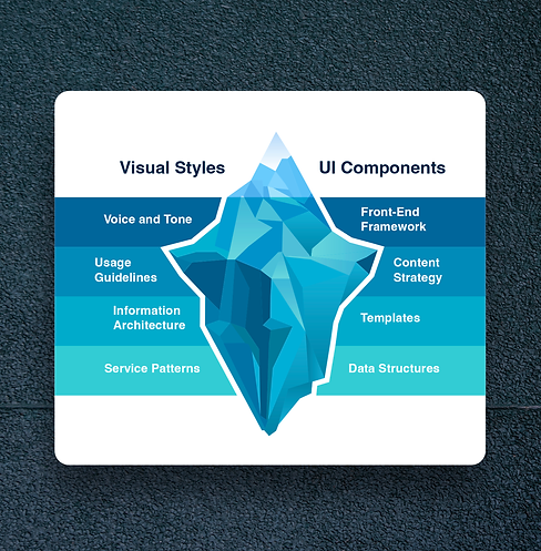
Beyond the Surface: What Design Systems Are Really Built On
The visible parts of a design system—tokens, components, libraries—tend to get the most attention. But the systems that actually endure are supported by deeper layers: shared language, clear documentation, meaningful critique, and a process that makes contribution safe and scalable.
As shown in the iceberg model, the top layer reflects what end users interact with—and what teams tend to focus on first. The layers beneath—framework, content strategy, IA, structure—do just as much to support adoption and longevity. Without them, even well-designed components can lead to confusion, rework, or abandonment.
This idea shaped how both systems were structured, documented, and maintained. The stronger the foundation, the easier it became for teams to build consistently, adapt to change, and trust the system as part of their day-to-day work.
Lessons Learned
The system gave teams something dependable. Designers had a shared foundation. Engineers knew what to build. The gaps closed, and the work sped up. It looked better. It worked better. And people finally trusted what they were working with.
-
Component libraries need to be discoverable and documented, or they won’t be used
-
Guidelines should make contribution easier—not more complicated
-
Systems should reflect how people work, not just ideal process
-
Shared language matters and needs to work for both design and engineering
-
The more trusted the system becomes, the less time teams spend reinventing things