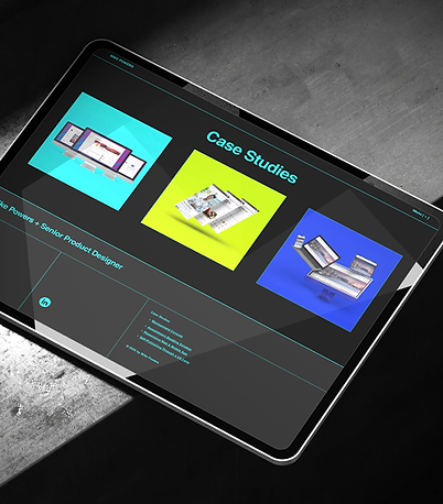
A showcase of innovative product design.
Responsive Web & Mobile App
Unifying the user experience across web, iOS, and Android through a responsive redesign, scalable design system, and improved premium upgrade flow
Launched across web, iOS, and Android, Spring 2022.
Improved App Store reviews, clarified premium upgrade flows, and laid the foundation for a reusable design system.

Overview
RoundGlass is a wellness startup building a platform to help users track and improve their personal health. This project focused on a responsive redesign of their existing web and mobile apps—modernizing the experience, improving usability, and aligning the product to new business and user goals.
Problem Statement
The existing product experience had grown fragmented over time—separate teams had built the web and mobile apps independently, resulting in misaligned flows, inconsistent UI patterns, and a content structure that didn’t scale well. Premium feature access was especially problematic; it confused users and impacted conversion. Internally, priorities shifted often, and teams with varying levels of UX maturity had competing expectations. This redesign needed to unify the experience across platforms, improve clarity around feature access, and support faster iteration going forward—all under tight timelines and with limited UX resourcing.
Users & Audience
The core users were health-conscious individuals using the app to access wellness content—everything from guided meditations and fitness sessions to healthy recipes and life coaching. We designed for both free users and paid subscribers, with the latter unlocking more advanced tools and personalized content. Their goals ranged from casual exploration to sustained habit-building. On the internal side, we also needed to support product and content teams managing a growing library of materials. That meant designing for scalability, content modularity, and consistent feature access across platforms.
Role & Responsibilities
As the Senior Product Designer, I led responsive UX design for both web and mobile platforms. I collaborated with cross-functional partners across multiple time zones—including product managers, engineers, and brand stakeholders. This was a fully remote project, and I worked closely with leadership to align on shifting priorities and translate them into scalable design decisions. In addition to redesigning key flows, I created a lightweight design system to unify styles and components, ensured WCAG-compliant accessibility, and advocated for UX consistency across teams with varying levels of design maturity.

Scope & Constraints
The project operated under tight timelines and a fast-moving roadmap. Product goals shifted frequently as the company evolved its broader platform strategy, which meant design work had to be flexible and often anticipatory. Legacy UX debt from previously siloed web and mobile development added complexity, especially as we worked to unify flows and visual patterns across platforms.
I collaborated closely with another designer based in India, primarily on the iOS and Android experiences. Our shared goal was to make sure all three platforms—web, iOS, and Android—felt cohesive and intentional, not like three separate products. One of the key tensions we navigated was our org manager’s belief that the web experience should differ meaningfully from mobile.
I understood the reasoning—web users often bring different expectations and behaviors—but rather than treating that as a mandate for divergence, I worked to identify where platform-specific adjustments were helpful and where consistency served the user better. On mobile, we kept native tab navigation; on web, we used a fixed vertical sidebar to support broader layouts and multitasking. But core flows—account creation, subscription access, and content playback—were standardized to reduce relearning across devices. I also created shared component libraries in Figma and collaborated with engineering to build a modular, reusable system that supported thoughtful variation without losing cohesion.
How I Tackled the Redesign
Translating evolving goals into clear, scalable patterns across web, iOS, and Android


Discovery & Early Framing
The project began with a comprehensive audit of the existing web and mobile experiences, which had been built in parallel by different teams. I mapped out where patterns, flows, and even core functionality had diverged—especially around navigation, content hierarchy, and feature access. The inconsistencies weren’t just visual; they affected how users understood and interacted with key parts of the platform.
Instead of jumping straight into redesign, I focused first on building alignment. I created a shared doc that outlined known pain points, flagged UX debt, and established a working vocabulary across teams. This became a touchstone for PMs, engineers, and leadership—helping to reduce ambiguity as we made decisions later on.
Formal research wasn’t part of the scope, but I pulled insights from support tickets, stakeholder walkthroughs, and session data. This revealed consistent friction around locked content, unclear upgrade logic, and inconsistent onboarding—especially for users who bounced between devices.
Design & Systemization
I led the creation of a responsive design system to unify the web and mobile experiences across iOS and Android. This included modular components, shared layout logic, and a consistent approach to flows like onboarding, content discovery, and premium access—areas where fragmentation had crept in.
We began the project in Sketch, but as remote work became standard, Figma was proposed as a more collaborative option. I initially raised concerns about connectivity, given the shift to home networks, and tested the free version on my own before helping lead the full migration. I rebuilt components, reorganized shared libraries, and documented updated patterns to support the transition.
The move to Figma changed more than tools—it improved how we worked. It made async reviews smoother, centralized feedback, and helped us maintain a shared source of truth. As we iterated, I partnered with the other designer to ensure platform differences were purposeful, not arbitrary. We adapted to native conventions where needed, but kept core interaction logic and structure consistent across devices.

Validation & Iteration
Rather than formal usability testing, we focused on fast feedback loops with internal stakeholders and a small group of trusted wellness providers. Since the apps were already live, we were able to validate improvements against real usage and support data. I created high-fidelity prototypes to demonstrate updated flows and used structured Figma walkthroughs with clear annotations to gather targeted feedback—especially useful across time zones.
Key iterations included streamlining mobile onboarding to better match the directness of the web version, refining upgrade prompts to reduce friction, and improving overall flow cohesion across platforms. These lightweight loops helped us stay responsive without compromising consistency.


Highlights
Key Constraints
-
Tight timelines
-
Shifting product goals
-
Distributed, global team
Design System Contributions
-
Reusable UI components
-
Token-based spacing & typography
-
Fed into broader system standards
Mobile First Priorities
-
Tap target compliance
-
Streamlined nav & onboarding
-
Responsive behavior across devices
Clear Wins
-
App Store ratings stabilized at 4.8+ within weeks of launch, with a noticeable uptick in reviews citing ease of use and visual clarity.
-
User reviews consistently pointed to improved navigation and content discovery, aligning with the project’s core design goals.
-
Internal adoption accelerated: multiple product teams reused key components in new features, helping unify UX across the platform.
-
The rollout was cited by leadership as a model for future design work, and many of the components and patterns directly fed into our broader design system effort, which I was leading in parallel.

“I really like [the new app]. The premium flow is clearer now. My clients aren’t as confused about what’s included, and I spend less time explaining what they’re signing up for. The layout feels calmer, better navigation… It’s easier to move around without getting lost or distracted.”
-Mindfulness Coach

“The responsive components we built with Mike made a huge difference. They handled layout shifts cleanly across breakpoints, and we didn’t have to rework anything when new screen sizes came in. Having dark and light mode baked in saved us a ton of styling time too. That system carried forward into at least three other projects during my tenure.”
-Senior UI Engineer
Outcomes & Lessons Learned
The redesigned experience shipped across web, iOS, and Android with strong internal adoption and visible user impact. App Store reviews improved, with users specifically calling out clearer navigation and a more polished interface. Internally, the new system helped unify future work, reduce design inconsistencies, and streamline engineering handoff. Figma became the default design tool, improving collaboration and centralizing decision-making.
Looking back, one of the biggest wins was reconciling competing priorities into a single, scalable system—one that respected platform differences but still felt like one product. If I were to revisit the project, I’d advocate for more structured user testing earlier in the process. But overall, the work reinforced my ability to lead large-scale systems thinking while staying close to both user needs and cross-team realities.
