A showcase of innovative product design.
Redesigning the Premium Experience
Clarifying value and enabling monetization across a global wellness platform
Overview
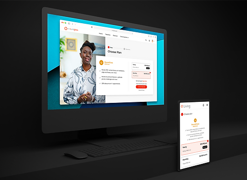
RoundGlass is a wellness startup offering a digital platform for health practitioners and clients. I led the redesign of the premium content experience—a key monetization touchpoint supporting paid sessions, tiered programs, and the platform’s version of MasterClasses. The work spanned multiple surfaces across the app, with a focus on reducing user confusion, improving pricing transparency, and making it easier for providers to create, manage, and promote premium offerings.
Problem Statement
Before this redesign, both clients and providers found the paid and premium flows inconsistent and unclear. There were gaps in pricing logic, access behavior varied by entry point, and visibility rules were difficult to trust—whether viewing content from a provider’s page, the home feed, or a premium program.
Providers faced a fragmented setup process, often requiring manual support. Internally, business and marketing teams lacked visibility into user behavior due to siloed implementation and inconsistent analytics. The goal was to reduce friction, align flows, and improve conversion—while designing a system that could scale across regions and platforms.
Users & Audience
Wellness Providers used the platform to monetize content and offer virtual services. Many had limited technical fluency and needed a streamlined setup process they could trust.
Clients accessed content across devices, expecting pricing to be clear and access to feel consistent. Gated flows and unclear CTAs led to drop-off or hesitation.
Internal Teams included business, marketing, and support—each relying on this flow for subscription revenue, campaign targeting, and help content. They needed a structured, trackable system with low support overhead and clearer optimization levers.
Roles & Responsibilities
I was the sole Product Designer responsible for the end-to-end experience across UX, UI, prototyping, documentation, and developer handoff. I led the initial web experience and later collaborated with a second designer in India to extend the patterns to mobile.
The team was fully remote and distributed across the U.S., Belarus, and India. I worked closely with our PM (also acting as Scrum master), the lead UI engineer, and internal stakeholders from the business and support teams. I also maintained and extended our Figma-based design system throughout.

Scope & Constraints
We had eight weeks to deliver a redesigned, Stripe-integrated flow, spanning multiple views: provider pages, premium program overviews, content tiles, and booking interfaces. There was limited access to formal research or usage analytics, and many existing flows had evolved in isolation.
We also had to account for:
-
Region-specific pricing across INR and USD tiers
-
Monthly, quarterly, and annual plans
-
Variable benefits (e.g. discounts, content unlocks, physical goods, and provider sessions)
-
Cross-platform entitlement syncing via Google Play, Apple Store, and Web
These complexities raised the bar for clarity, modularity, and trust-building—both in content and pricing.
Design Approach & Execution
How I mapped, prototyped, and delivered a scalable monetization experience
Mapping Complexity into Action
The PM handled the initial experience audit. Together, we reviewed known issues across content visibility, purchase paths, and onboarding. We identified two core monetization paths:
-
Standard Paid Flow
For one-time purchases (e.g. classes, sessions)
-
Premium Flow
For tiered subscriptions and recurring access (e.g. Living+)
This distinction shaped how we structured the user experience and prioritized improvements. I collaborated with the PM and business leads to clarify monetization goals, Stripe dependencies, and known support pain points.


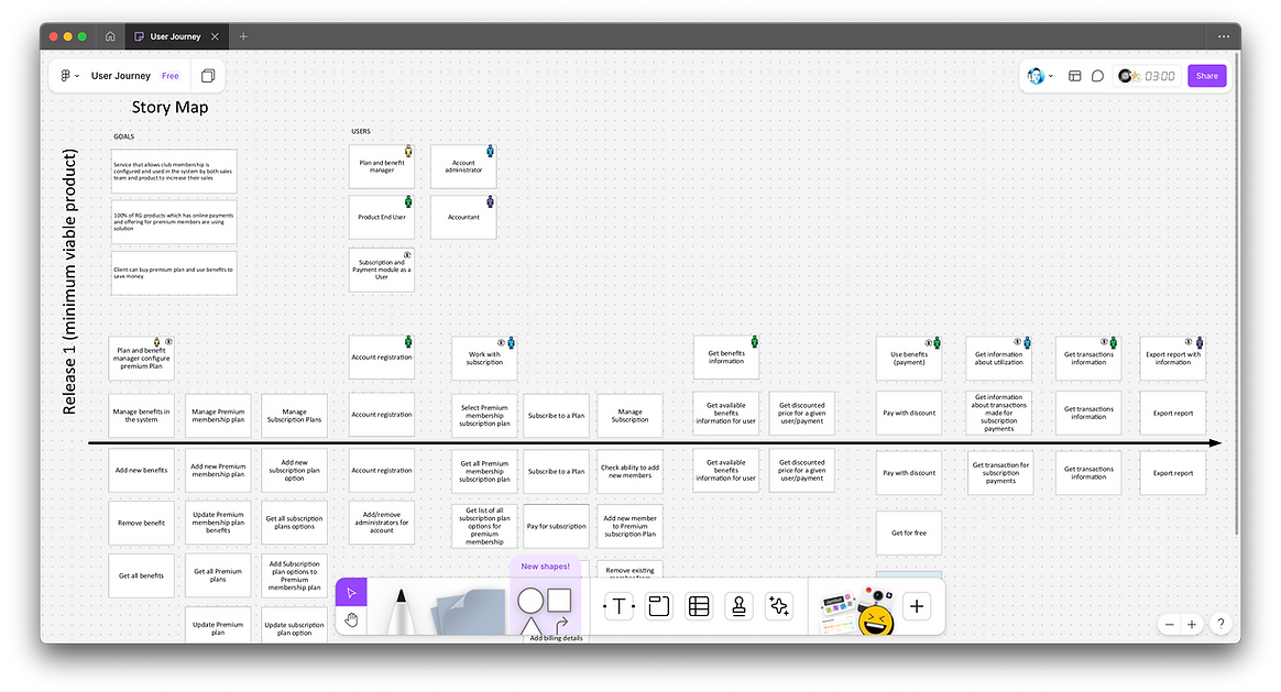
Clarifying Structure & Flow
The PM created a revised site map while I focused on detailed user flows. These mapped out key client actions (e.g. browsing, purchase, access expiration, and logged-out states) and provider-side tasks (e.g. content setup, pricing selection, and benefit assignment).
I built low-fidelity wireframes to simplify pricing logic, clarify gated access, and support modular reuse. Content tiles, CTAs, and pricing displays were refined to emphasize transparency and trust, regardless of entry point.
Designing for Flexibility & Confidence
I created high-fidelity prototypes in Figma simulating full purchase journeys—from discovery through confirmation. We tested these with internal stakeholders and a pilot group of active providers.
Feedback led to several key improvements:
-
Clearer distinction between subscription tiers and à la carte options
-
Simplified benefit display logic, accounting for overlapping plans
-
Embedded previews and status indicators to boost provider confidence
-
A streamlined onboarding wizard, adapted from an earlier provider tool I had built
All new patterns were documented and added to the design system. I also supported engineering in aligning flows with Stripe and ensuring entitlements synced across web and mobile.

“This project forced me to reconcile business, technical, and user needs in a single system—without oversimplifying any of them. It was a crash course in balancing flexible architecture with legible UI.”


Outcomes & Lessons Learned
Launch Impact & Measurable Gains
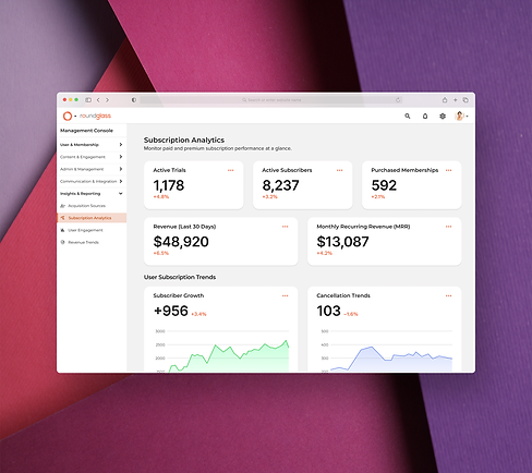
The redesigned flows launched on time across web and mobile, fully aligned with Stripe and our updated design system. Internally, performance was tracked across:
-
Active trials and subscriber counts
-
Revenue and MRR growth
-
Subscription cancellations and churn
-
Platform-level differences in adoption

Initial impact included:
-
Stronger provider confidence during setup
-
Fewer manual support interventions
-
More reliable access experiences for users
-
Clearer paths for business and marketing optimization
What I’d Do Differently
If I had more time, I would’ve pushed for:
-
Early testing with newly onboarded providers, who often brought the sharpest insights
-
Dedicated post-launch analysis of conversion and churn
-
Closer integration with our performance dashboard to tie behavior back to business goals
This project reinforced the need to design around clarity, confidence, and flexible logic—especially when real money is involved. It also helped me refine my ability to work fast, build consensus across time zones, and design scalable systems for a growing product.